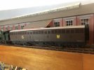
SimonD’s workbench

simond

Western Thunderer
Wholly concur, a lack of attention to detail. Unfortunately it's the way today - use the default computer rather than find the correct typeface/font as it appears right. Having the correct typeface/font is one of my geeky traits :) - so much so - as I have managed to find and download: Gill Sans for later LNER and British Railways up to 1965; Johnston (or Johnston Sans) for London Transport from 1933; Rail Alphabet (Jock Kinneir and Margaret Calvert) for British Rail from 1964; Futura Mb BT for Deutsche Bundesbahn 1950s-80s station signs and alte DIN 1451 Mittelschrift for german road signs.


Yes the '2' appears to be more Maunsell SECR/SR style. Also the 'G' at the end of SIPHON. G on the model doesn't have the vertical tail as on the CPL decal sheet - similar to the G in GW.

However, it is possible the GW simplified their typeface with the introduction the the shirt button monogram.

Whilst I hadn’t actually noticed, it’s one of those things that, once evident, will continue to annoy, so steps have been taken, as you have seen.

I think it’s a shame that something that would have cost precisely zero manufacturing cost ends up requiring adjustment. I guess the same could be said for the actual number.

The door latches, hand holes and door handles are perhaps more debatable, but again, it seems the model is based on an unlikely example.

Still it’s a good looking model, hopefully a bit better for the mods I’ve made.

atb
Simon
 

Paul Tomlinson

Western Thunderer
Coincidentally, the current MRJ (298) contains a review of Accurascale's 4mm offering. Mentioned too is the forthcoming book on Siphons from the HMRS.
A shot of prototype and model from the issue (Yorkshire Dave's post above about the change in typeface is interesting) :
IMG_1314.jpeg
 

MarkR

Western Thunderer
The much anticipated book on the GWR Siphons is being published by Wid Swan Books, rather than the HMRS.
Mark
 

Yorkshire Dave

Western Thunderer
Apologies for the slight diversion @simond - the only saving grace it is GW related smile.png. As as you've mentioned - once seen you cannot 'unsee' it.

Coincidentally, the current MRJ (298) contains a review of Accurascale's 4mm offering. Mentioned too is the forthcoming book on Siphons from the HMRS.
A shot of prototype and model from the issue (Yorkshire Dave's post above about the change in typeface is interesting) :
IMG_1314.jpeg

Even this demonstrates the lack of attention to the number and SIPHON. G lettering. The number on the model looks like Arial (as noted by @Heather Kay on the Minerva model) and should more like the Maunsell SECR/SR style wagon numbers. The G at the end of SIPHON. G is wrong compared to the prototype photo.

These are cruel slices from the image to try and provide a better comparison. Even the old 1980s Lima GW shirt button monogram 4mm model has the number style more correct although too widely spaced. And the G at the end of SIPHON. G is closer to the prototype.

Siphon G 3.jpg

On the other hand the manufacturers may have provided all the correct lettering information to the factory who in turn decided to apply the closest 'off the shelf' match - which becomes a quality control issue.
 

simond

Western Thunderer
thanks Dave, no apologies required!, thanks also to Mark & Paul. I guess another book to buy.

I note also that the order of "SIPHON. G" and "XXXX" are reversed - earlier vehicles had the text before the number - this appears to be contemporaneous with the change from "G W" to the shirtbutton. Perhaps the aforementioned tome will confirm or correct.

Barring disasters, numbers, dynamo, weathering and done, tonight.

cheers
Simon
 

76043

Western Thunderer
Nice to see some discussion on typefaces, it's my personal pet hate being a trained graphic designer. Looks to me like the Helvetica/Arial families, which considering Helvetica was launched in 1956, is as wrong as any rivet you can find in the wrong place.
Cheers
Tony
 

simond

Western Thunderer
Ok, no lettering on this one!

The job is to sort out the chassis of this little beauty, Chris T’s (@Pencarrow )1366 out of the Agenoria stable.

image.jpg

The loco looks great, but the 4-point compensation is as you might expect, entirely unsatisfactory (and, obviously, not compensation). Milkmaids did not use four legged stools. It’s a shame as it rolls sweetly, but I imagine an abrupt stop might lead to a “stoppie” with the rear wheels clear off the track.

There appears to be a complete Premier chassis as well as the kit one. Chris sent over some drawings a few weeks back, so I’ve been looking at 3DP cylinders, I think it might need a backhead too.

I might take the opportunity to upgrade my own loco too, which came from CRT kits many years back. It too was not an ideal example of a loco kit, and required “a degree of scratchbuilding”.

Given that there are a few other things on the bench, and work is a bit demanding presently, it might not be a quick build, you are advised not to hold your breath!

image.jpg

Atb
Simon
 

Pencarrow

Western Thunderer
View attachment 197372View attachment 197373

I wonder if mine’s too high or his is too low…

My utmost and sincere thanks to Simon for taking on the long, long battle that has been the 1366 build. It's nearly ended in the bin many, many times.

The final straw was realising the frames and particularly the cylinders were just wrong. A side on comparison between a real 1366 and the model shows the frames extend too far down to the railhead. I think Simon is also right that the footplate is too low.

Oh, but those horrible, horrible kit cylinders - too thin, too long and the steam chest the wrong shape.
 

simond

Western Thunderer
s' funny, it's where I started.

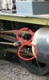
I don't think the CRT slide bars are going to be much use...

1696450824517.png

they don't quite bridge the gap between the motion plate and the cylinder rear cover!

(the motion bracket is too thick too, but that's easy)

I think I'll make some slide bars from steel strip and then I can embed them in the cylinders and solder them to the (thinner) motion brackets and hopefully that'll be that boxed off.

More soon
S
 

simond

Western Thunderer
1696452422474.png

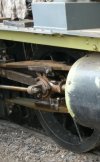
Oil Pots don't look right, I'll have to dig a bit. Looking at the pic Chris posted above, I can't see any. That helps :)

Motion bracket still looks too thick. Drawing is difficult to read, it might be 1 1/2" but it might be something else.
 
Top