You are using an out of date browser. It may not display this or other websites correctly.
You should upgrade or use an alternative browser.
You should upgrade or use an alternative browser.
Dublingham Goods Station
- Thread starter 76043
- Start date


Yorkshire Dave
Western Thunderer
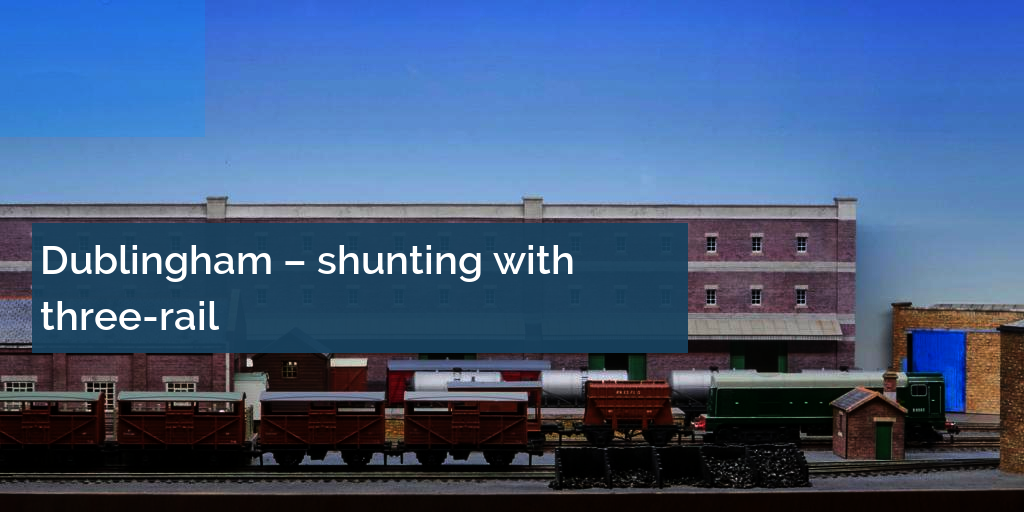
The layout looks good - nice and simple backscene to keep the eye focused on the main subject.
Personally I've never been a fan of the 'Peco Helicopter' photos, however, I do feel one of the entire layout is sufficient to provide an overall context. My preference is for long or medium shots taken at scale eye-level as in the second one above.
Personally I've never been a fan of the 'Peco Helicopter' photos, however, I do feel one of the entire layout is sufficient to provide an overall context. My preference is for long or medium shots taken at scale eye-level as in the second one above.
76043
Western Thunderer
Thank you Dave. I am struggling with the backscene at the moment as I got some rain on it and being waterbased inks has spots all over it, so needs replacing. Am considering putting an image of a building on the right hand side between the warehouse and the building with the large blue door, but I keep thinking it should stay simple.
Tony


Tony
I think it looks great just as it is. The plain sky background looks absolutely right to me.Thank you Dave. I am struggling with the backscene at the moment as I got some rain on it and being waterbased inks has spots all over it, so needs replacing. Am considering putting an image of a building on the right hand side between the warehouse and the building with the large blue door, but I keep thinking it should stay simple.
Tony
View attachment 187038View attachment 187039
Yorkshire Dave
Western Thunderer
Am considering putting an image of a building on the right hand side between the warehouse and the building with the large blue door, but I keep thinking it should stay simple.
If you feel you need to fill the gap, rather than make a building why not just paint faded grey shapes on the backscene as @Neil has done in his thread Life in a Northern Town.
Here as an example I've just lifted a photo of Poplar in the 1950s and faded it.

Yorkshire Dave
Western Thunderer
This is what it could look like with both 'wings' filled to match.

Neil
Western Thunderer
I like the faded grey method. As Northern Town lives in my garage I worry about the use of paper and card gradually absorbing any moisture so I needed a painted approach and I wanted to see how minimal I could go. For a smaller indoor layout I would have no worries about print outs or paintings/drawings on paper fading away to grey.
Joe's Garage
Western Thunderer
I do "like" the overall effect of the layout and the setting, very well presented.
Thank you for sharing and please keep posting.
Cheers
Julian
Thank you for sharing and please keep posting.
Cheers
Julian
76043
Western Thunderer
The Silverfox show is fast approaching and the point switches failed at Luton because I didn't install a CDU. I installed a secondhand CDU today and replaced the five switches because they burnt out. There's no buzzing noise when I throw the points, just a clean sounding throw.
Lesson learnt, should have installed one at the beginning.
Anyway, the Silverfox show is on the 19th.


Tony
Lesson learnt, should have installed one at the beginning.
Anyway, the Silverfox show is on the 19th.
Tony
76043
Western Thunderer
I've got a write up on Dublingham ahead of the GETS show in October, very happy with that!
 www.keymodelworld.com
Dublingham three-rail shunting layout
TONY HARRIS set out to see if he could follow the railway rulebook accurately as a Hornby Dublo three-rail model collector. Dublingham is the result.
www.keymodelworld.com


Yorkshire Dave
Western Thunderer
It's really nice to see the correct typeface in use, as I would have expected you to have done so  .
.
Put a fourth rail down and use Johnston Underground and you'll have a LT yard") .
.
As an aside I didn't realise Eric Gill was Edward Johnston's pupil while they worked together at the London Underground Group prior to it's 1933 amalgamation into LPTB.
.Put a fourth rail down and use Johnston Underground and you'll have a LT yard
.As an aside I didn't realise Eric Gill was Edward Johnston's pupil while they worked together at the London Underground Group prior to it's 1933 amalgamation into LPTB.
76043
Western Thunderer
Thank you @Yorkshire Dave, I do try to get my typefaces right, if you're going to count rivets, you should get your typefaces right!!
I didn't know Gill worked with Johnston at that time, but as both were artists they would have known each other. I always thought that Gill basically ripped off Johnston for monotype, but then Johnston ripped off the Romans, so not even his typeface was really new.
Many at exhibition have asked where is the fourth rail? Some even asked if the third rail is actually live, whilst others didn't even notice it! All part of the banter of exhibitions which is really good fun.
Cheers
Tony