You are using an out of date browser. It may not display this or other websites correctly.
You should upgrade or use an alternative browser.
You should upgrade or use an alternative browser.
Monks Ferry: a layout for the Grandchildren.
- Thread starter jonte
- Start date
David Waite
Western Thunderer
It’s certainly taking shape now and looking fantastic, it reminds me of some old buildings I’ve seen in Melbourne.
David.
David.
John57sharp
Western Thunderer
jonte
Western Thunderer
Thank you, David.It’s certainly taking shape now and looking fantastic, it reminds me of some old buildings I’ve seen in Melbourne.
David.
I’ve not visited Australia, but I would imagine that as a former colony, the buildings would be built in the style (and era) of those of our own capital, and one that I’m loosely trying to convey, so your comment is most welcome.
Although based loosely on Blackfriars, in practise, it’s merely an exercise in expediency, so involves a lot of making it up as I go. For instance, the Victorians appeared to have a penchant for window dressing even the most functional of constructs, such that I’m beginning to think that the turrets could serve as a prime example, disguising perhaps a dusty old lift shaft lying beneath the facade.
As I’m not quite sure where I’m going with the rest of it, this notion would help with the design of the sidewalls, which would contain a dressed entrance to the shafts for staff/vehicles involved in the loading/unloading of parcels onto trains.
Well, that’s the latest thinking at least

Cheers
Jon
jonte
Western Thunderer
Just seen this over on FB Jon, not dissimilar. This first Liverpool Exchange, demolished 1886. Yours is looking great.
John
View attachment 209439
Now that’s a compliment

I’ve not seen that one before, Jon, so thank you.
Incidentally, from memory, I think this was the former Italianate incumbent which replaced the original Tithebarn station, which stood a little to the right of the later station, on - as expected - Tithebarn Street.
Funnily enough,I’m thinking of placing a ramp served raised forecourt on my version.
In addition, I squirrelled this one away as a guide to how I intend to eventually paint the model:
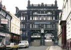
Yep: the later Exchange Station which still stands:

Glad to see I’m along the right lines

Thanks again, John, for your interest.
Jon
Last edited:
simond
Western Thunderer
the colonial architecture is quite striking, Sydney and Mumbai boast exquisite rail terminals, the latter in a similar style to St Pancras.I’ve not visited Australia, but I would imagine that as a former colony, the buildings would be built in the style (and era) of those of our own capital, and one that I’m loosely trying to convey, so your comment is most welcome.
jonte
Western Thunderer
Thanks, Simon.the colonial architecture is quite striking, Sydney and Mumbai boast exquisite rail terminals, the latter in a similar style to St Pancras.
I’ll check them out.
Jon
Roger Pound
Western Thunderer
Excellent work, Jon. If you follow the colonial road, you'll find some interest possibilities on the actual locos and stock scene too. Not wishing to divert you to H0, of course ............. !!
!!
Roger
 !!
!!Roger

jonte
Western Thunderer
Excellent work, Jon. If you follow the colonial road, you'll find some interest possibilities on the actual locos and stock scene too. Not wishing to divert you to H0, of course .............!!
Roger


And there’s me banking on you keeping me on track

Thanks, Roger!
Jon
jonte
Western Thunderer
Without access to workshop or modelling room for the present, a decision was made to address the roof which could be built on a tiny makeshift workspace, and away from the model as a separate project.
To this end, a sheet of 2.5mm styrene was purchased to use as a base, and which can be trusted not to warp when exposed to styrene cement. Offcuts of thinner styrene were pressed into service and used to make a frame on which to set surfaces of the roof:

Then a chimney of sorts was constructed, again from offcuts, and built on a plinth of more scrap to keep things square:

Although Blackfriars sported four chimneys, two on each side, for quickness, I decided just to construct the one, sited centrally at the apex. It’s pretty plain in appearance and without pots, much like Blackfriars’, although it also sports a cornice of sorts. I’ve a feeling it would have been of dressed (London) brick,but I’m going to try and con the viewer into believing it’s of limestone with paint. Well, that’s the idea. We’ll see.
Then it was glued centrally to the base of the roof, and the ore cut roof sections cut to accommodate:

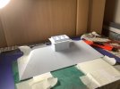
The sections are now glued to the frame and taped until set:

Once dry, the sections will be sanded flush and have graph paper adhered to the surfaces to act as guides for the slates. Prior to fitting the slates, however, the five dormers will be fabricated and cut to fit (more LCut Creative sections).
They can just be made out behind the parapet here:

Cheers for now.
jonte
To this end, a sheet of 2.5mm styrene was purchased to use as a base, and which can be trusted not to warp when exposed to styrene cement. Offcuts of thinner styrene were pressed into service and used to make a frame on which to set surfaces of the roof:

Then a chimney of sorts was constructed, again from offcuts, and built on a plinth of more scrap to keep things square:

Although Blackfriars sported four chimneys, two on each side, for quickness, I decided just to construct the one, sited centrally at the apex. It’s pretty plain in appearance and without pots, much like Blackfriars’, although it also sports a cornice of sorts. I’ve a feeling it would have been of dressed (London) brick,but I’m going to try and con the viewer into believing it’s of limestone with paint. Well, that’s the idea. We’ll see.
Then it was glued centrally to the base of the roof, and the ore cut roof sections cut to accommodate:


The sections are now glued to the frame and taped until set:

Once dry, the sections will be sanded flush and have graph paper adhered to the surfaces to act as guides for the slates. Prior to fitting the slates, however, the five dormers will be fabricated and cut to fit (more LCut Creative sections).
They can just be made out behind the parapet here:

Cheers for now.
jonte
Yorkshire Dave
Western Thunderer
And the same view today - the only consistent item is the neoclassical art-deco Unilever House (was Lever Brothers HQ) on the other side of the bridge. The station entrance is now round the corner on the junction of Queen Victoria Street and Blackfriars Bridge.

And of course after crossing Queen Victoria Street the line now dives down into City Thameslink under rather than across Ludgate Hill - the City Thameslink platforms can just be seen. The new bridge immediately the other side of the building is built on a gradient (my photo).

Don't know whether this will be useful showing the old roof trusses and how shallow the roof was at Blackfriars (my photo).


And of course after crossing Queen Victoria Street the line now dives down into City Thameslink under rather than across Ludgate Hill - the City Thameslink platforms can just be seen. The new bridge immediately the other side of the building is built on a gradient (my photo).

Don't know whether this will be useful showing the old roof trusses and how shallow the roof was at Blackfriars (my photo).

Last edited:
jonte
Western Thunderer
And the same view today - the only consistent item is the neoclassical art-deco Unilever House (was Lever Brothers HQ) on the other side of the bridge. The station entrance is now round the corner on the junction of Queen Victoria Street and Blackfriars Bridge.
And of course after crossing Queen Victoria Street the line now dives down into City Thameslink under rather than across Ludgate Hill - the City Thameslink platforms can just be seen. The new bridge immediately the other side of the building is built on a gradient (my photo).
Don't know whether this will be useful showing the old roof trusses and how shallow the roof was at Blackfriars (my photo).
Thanks, Dave.
My, how things have changed. This would have been a more straight forward option to build

I’ve seen several photos on line whilst loosely researching but not of this quality, so they will prove invaluable whilst I weigh up my options re choice of canopy. Latest thinking is Airfix type canopies linked via I beams which will rest on perhaps what’s left of the station walls (think Sheffield Victoria) to aid lifting off for track cleaning.
Cheers,
Jon
Edit: Btw, you’ve omitted the Monks Ferry line from your illustrated map in post #3150 of Prototype - Tim Mills' Photos

Last edited:
Lyndhurstman
Western Thunderer
That's some lovely work, Jon. Especially as you're working remotely 
Cheers
Jan

Cheers
Jan
jonte
Western Thunderer
Thanks, JanThat's some lovely work, Jon. Especially as you're working remotely
Cheers
Jan
The ‘bench’ itself is one of those (formerly telephone table?) varnished half-moon tables that my wife takes pride in which usually adorns the hallway of our modest home. Set up in a back bedroom, with the smallest table of a nest of tables nestling alongside on which to plonk materials, it serves a purpose most adequately; adequately-ish.
To say it’s cramped would be an understatement
 I am grateful to my wife, who not only looks after me very well, but frequently comes up with bright ideas such as this, so once more I find myself in her debt
That said, there was a slight caveat imposed: don’t get glue all over it!
Erm, if you look closely at the last set of photos, you’ll notice a wet looking patch to the left hand side of the mat……..the contents of half a bottle of liquid poly were spilt as I clumsily worked t’other night (there really is barely any room to swing a cat, being pressed up against the fitted wardrobe doors that span the bedroom length). What you see on the mat, are the remains of quarter of the bottle……the other quarter seeped through the protective tea towel onto the table below
 I dabbed it with loo paper in an effort to clean it up, but haven’t had the nerve to look since…..
When my wife returned, she commented on the strong whiff of glue emanating from the rear bedroom. I changed the subject

Jon
Roger Pound
Western Thunderer
A good strategy if you can get away with itWhen my wife returned, she commented on the strong whiff of glue emanating from the rear bedroom. I changed the subject
Jon
 . However, depending on the type of varnish used on the table and the sort of cement spilt I would recommend you have a list of french polishers up your sleeve to avoid Debbie's wrath should the worst have come to pass.......
 .
.Roger
 .
.jonte
Western Thunderer
A good strategy if you can get away with it. However, depending on the type of varnish used on the table and the sort of cement spilt I would recommend you have a list of french polishers up your sleeve to avoid Debbie's wrath should the worst have come to pass.......
.
Roger.

jonte
Western Thunderer
Just a final one for the time being, to show the roof loosely placed on the model and with the graph paper guides affixed, which will help to place the ‘slates’ as straight and true as possible without recourse to more accurate methods of construction, those which lie far outside my skill set:
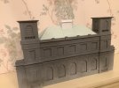
Cheers for now.
jonte

Cheers for now.
jonte
John57sharp
Western Thunderer
Fabulous looking model, and the graph paper is a genius idea… I wish you and your wife well as you seek to manage the, er, sticky, glue issue….
Today has not been good for modelling, I've been doing open heart surgery on our lad’s PC following a rather sparky power unit failure. This is part of a much longer story which I may recount later, maybe.
As TinTin says (para) “…but Captain, it's only Monday”
John
Today has not been good for modelling, I've been doing open heart surgery on our lad’s PC following a rather sparky power unit failure. This is part of a much longer story which I may recount later, maybe.
As TinTin says (para) “…but Captain, it's only Monday”
John
jonte
Western Thunderer
Fabulous looking model, and the graph paper is a genius idea… I wish you and your wife well as you seek to manage the, er, sticky, glue issue….
Today has not been good for modelling, I've been doing open heart surgery on our lad’s PC following a rather sparky power unit failure. This is part of a much longer story which I may recount later, maybe.
As TinTin says (para) “…but Captain, it's only Monday”
John
Kind of you to say so, John, thank you

The graph paper helps as I’m no good at drawing straight lines on slopes

You appear to be the techno-wizard I wish I was, Jonny; a bit late for me now, so I’ll just stick to paper ‘n’ pencils and stuff, and try not to get the glue stuck in what’s left of my barnet

Btw, you can share your tale of woe with me anytime, John; always willing to listen/read. However, I fear it would probably be wasted on my steam powered brain.
Good luck with the surgery

Jon
jonte
Western Thunderer
A further gentle nod in the direction of the original, has seen the addition of only three, and not five, dormers:
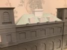
Knocked up from some scrap 1mm styrene left over from the construction of the roof (I had intended to use some window sections from LCut to save time, which in the event looked a little under nourished), they were topped off with more watercolour paper to represent the arched rooves. Using the same method I use to curve the diverging stock rail when track building, the curve was formed by placing a strip of paper firmly between forefinger and thigh, and pulling. To increase the radius of the curve, this was repeated, only on this occasion, the handle of a modelling paint brush replaced my pinky. I’ll probably revisit in the near to add a tad more detail, but they’ll do for now.
And so to the mind numbingly boring task of tiling/slates begins:

More graph paper put to good use I find, with sections for slates measuring 4 x 3 millimetres giving the best representation, whilst being easier to handle. The extra millimetre on the width provides a lip onto which an adjacent row can be placed to provide some relief, the thinness of the paper helping to alleviate the stepped look.
Yes, they’re not perfect, which also goes for the spacing, but I can live with it, especially here in the land of make-believe.
Here’s a quickie from the past to show what they should look like when painted up:

Actually, the ridge tiles (yes, they’re there!) paled due to placing them more at more of a scale distance apart so wider spacing is the lesser of two evils. None of it mattered, however, as it was just an exercise in self indulgence…..
And so, with the dulcet tones of Mr. Manilow reminding me that he couldn’t possibly smile without me, I’ll continue to cut ‘n’ paste ‘ad infitum’.
I’ll report back when the task is complete.
See y’all in a couple of years or so.
jonte

Knocked up from some scrap 1mm styrene left over from the construction of the roof (I had intended to use some window sections from LCut to save time, which in the event looked a little under nourished), they were topped off with more watercolour paper to represent the arched rooves. Using the same method I use to curve the diverging stock rail when track building, the curve was formed by placing a strip of paper firmly between forefinger and thigh, and pulling. To increase the radius of the curve, this was repeated, only on this occasion, the handle of a modelling paint brush replaced my pinky. I’ll probably revisit in the near to add a tad more detail, but they’ll do for now.
And so to the mind numbingly boring task of tiling/slates begins:

More graph paper put to good use I find, with sections for slates measuring 4 x 3 millimetres giving the best representation, whilst being easier to handle. The extra millimetre on the width provides a lip onto which an adjacent row can be placed to provide some relief, the thinness of the paper helping to alleviate the stepped look.
Yes, they’re not perfect, which also goes for the spacing, but I can live with it, especially here in the land of make-believe.
Here’s a quickie from the past to show what they should look like when painted up:

Actually, the ridge tiles (yes, they’re there!) paled due to placing them more at more of a scale distance apart so wider spacing is the lesser of two evils. None of it mattered, however, as it was just an exercise in self indulgence…..
And so, with the dulcet tones of Mr. Manilow reminding me that he couldn’t possibly smile without me, I’ll continue to cut ‘n’ paste ‘ad infitum’.
I’ll report back when the task is complete.
See y’all in a couple of years or so.
jonte


