Pencarrow

Western Thunderer
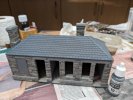
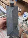
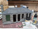
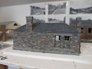
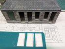
Base coat on the roof of 70.836 London Grey to get the who thing roughly the same colour and to hide the superglue stains.

PXL_20240127_200757696.jpg

Not a heavy coat of paint, don't want to lose the tile definition, and definitely not a uniform coat.

Edit: just found a useful colour photo of the roof, so that will help the next stage of painting.
 
Last edited:

Pencarrow

Western Thunderer
And we're back in the room...

This morning has started with having a close look at the roof colouring in the prototype photo. A base grey, highlights and patches of lighter grey, orange/brown and dark grey.

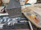
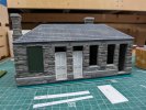
First on, 73.601 grey surface primer. Using this not because it's a primer but because I noticed and liked the way it was covering thinly when using it to primer the rear windows. Me follow the instructions?...

PXL_20240128_093656672.jpg

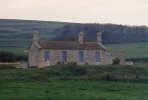
The photo is on page 100 of Peter Gray's West Country Railways. The printing, light and photo in this case make the stonework look almost white-grey, rather than the grey-brown in other photos. I think it's a case of pick a colour that looks right on the model and stick with it.
 

Pencarrow

Western Thunderer
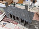
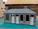
And followed by the orangy mix that was on the wet palette already, just dabbed on with the spiky tips of a flat brush.

PXL_20240128_102617590.jpg
Same approach again with some 70.988 Khaki, particularly around the leaded areas.

And, a bit of toning down by going over the brightest bits with some of the original base grey.

PXL_20240128_104420082.MP.jpg

That will do for now.
 

Yorkshire Dave

Western Thunderer
The photo is on page 100 of Peter Gray's West Country Railways. The printing, light and photo in this case make the stonework look almost white-grey, rather than the grey-brown in other photos. I think it's a case of pick a colour that looks right on the model and stick with it.

Yes, you can look at several colour photos and each will appear different due to lighting, exposure and reproduction. As you say it's a case of using them as guides. Fields visits today can assist but we'd have to take into account 60+ years of weathering, lower pollution levels due to the various clean air acts and subsequent sandblasting and cleaning by new owners.

The underlying geology and quarry locations will provide a clue to the building stone colouring. Although not Bodmin, this is a crop of one of my dad's slide of Abbotsbury taken from the road in 1961 and does show variances in the stone colours despite the distance.

However, given it's location this could well be Portland group sandstone laid down during the Jurassic period whereas the Bodmin sandstones were laid down in the earlier Devonian period which would account for it's slight reddish brown colour being of a desert origin. During the Devonian period England was experiencing desert conditions. Sea levels rose during the Jurassic period leading to sandstones being laid down in marine conditions which tend to be a pale buff/yellow/very very pale beige colour.

Therefore, despite the colour photographs, I would go with the slightly brownish, pinkish, reddish sandtone building colours as you have done. :thumbs:

Abbotsbury 1961.jpg

I've now given it a coat of paint. Mostly 70.863 Gunmetal Grey, with a touch of 70.883 Silver Grey to lighten it up.

I used Gunmetal and a grey for the flashing on this building I built several years ago. Looks a bit washed out but in reality it does have a slight sheen in places.
Bldg 24.jpg

This morning has started with having a close look at the roof colouring in the prototype photo. A base grey, highlights and patches of lighter grey, orange/brown and dark grey.

The colour of the slates will ultimately depend on the quarry and weathering in the final location.

For the slates on this building (an Intentio Bothy I built a few years ago) I lightly drybrushed a very pale brown/grey mixture to highlight the texture of the card slates given slates have a texture when split. They appear smooth from a distance but in close up they are undulatory.

Bothy 57.jpg

Having built these a few years ago I need to revisit them at some point to look at the weathering and some subtle green and pale brown washes.

Apologies for the geological and other interruptions. :)
 
Last edited:

Pencarrow

Western Thunderer
Yes, you can look at several colour photos and each will appear different due to lighting, exposure and reproduction. As you say it's a case of using them as guides. Fields visits today can assist but we'd have to take into account 60+ years of weathering, lower pollution levels due to the various clean air acts and subsequent sandblasting and cleaning by new owners.

The underlying geology and quarry locations will provide a clue to the building stone colouring. Although not Bodmin, this is a crop of one of my dad's slide of Abbotsbury taken from the road in 1961 and does show variances in the stone colours despite the distance.

However, given it's location this could well be Portland group sandstone laid down during the Jurassic period whereas the Bodmin sandstones were laid down in the earlier Devonian period which would account for it's slight reddish brown colour being of a desert origin. During the Devonian period England was experiencing desert conditions. Sea levels rose during the Jurassic period leading to sandstones being laid down in marine conditions which tend to be a pale buff/yellow/very very pale beige colour.

Therefore, despite the colour photographs, I would go with the slightly brownish, pinkish, reddish sandtone building colours as you have done. :thumbs:

View attachment 207755


I used Gunmetal and a grey for the flashing on this building I built several years ago. Looks a bit washed out but in reality it does have a slight sheen in places.
View attachment 207746


The colour of the slates will ultimately depend on the quarry and weathering in the final location.

For the slates on this building (an Intentio Bothy I built a few years ago) I lightly drybrushed a very pale brown/grey mixture to highlight the texture of the card slates given slates have a texture when split. They appear smooth from a distance but in close up they are undulatory.

View attachment 207745

Having built these a few years ago I need to revisit them at some point to look at the weathering and some sublte green and pale brown washes.

Apologies for the geological and other interruptions. :)

No apologies necessary Dave, always good to get some dialogue on the thread!

It's also good to hear you think I've got the colour balance about right. Interesting to understand a bit more about the geology in the area. The different colours of stone in a typical building are quite apparent in photos - would be interesting to see what the quarry face looks like - just how mixed is the colour?
 

Pencarrow

Western Thunderer
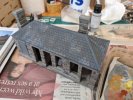
Not quite sure if Vallejo do a BR(S) now green equivalent but for stuff in the background I've previously used 70.888 Olive Green as, particularly when weathered down, it looks like a worn version.

I started painting the green stuff on this building the same but decided it wasn't quite green enough and too dull. So I've had a rummage through Grahame's paints and found 71.014 Gunship Green, which looks better.

Nowhere near as bright as the official colour made by the like of Precision but I think in scale for that's a bit too in your face.

PXL_20240128_115156101.MP.jpg
 

Pencarrow

Western Thunderer
I don't do scenery....yet.

When I do all this will be very useful and no doubt I'll be full of questions, whilst the subject matter (and scale) is light years different from this, the techniques and skill set required will be exactly the same no doubt.

Hi Mick, yes I use the same techniques and materials in whatever scale I work in. The difference is the detail you can add, both in scenery and buildings.
 

Yorkshire Dave

Western Thunderer
Not quite sure if Vallejo do a BR(S) now green equivalent but for stuff in the background I've previously used 70.888 Olive Green as, particularly when weathered down, it looks like a worn version.

I started painting the green stuff on this building the same but decided it wasn't quite green enough and too dull. So I've had a rummage through Grahame's paints and found 71.014 Gunship Green, which looks better.

Nowhere near as bright as the official colour made by the like of Precision but I think in scale for that's a bit too in your face.

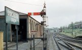
For the more exposed green paintwork it might be worth experimenting with a white/yellow/buff wash to fade the paint slightly to replicate the weathering and sun bleaching.

Although not brilliant this is a crop from one of my dad's 1961 slide of Dorchester South with the faded paintwork on the goods shed door and the nameboard posts on the left.
Dorchester South 02 1961.jpg

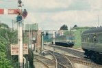
And one taken at Maiden Newton (again in 1961). Although it was a GW station it came under Southern Region control for a while and everything was painted green. The photo was taken through the DMU cab window however it does show how the paint has faded.
Maiden Newton 1961.jpg
 

Yorkshire Dave

Western Thunderer
I don't do scenery....yet.

When I do all this will be very useful and no doubt I'll be full of questions, whilst the subject matter (and scale) is light years different from this, the techniques and skill set required will be exactly the same no doubt.

Like Chris I use the same scenic techniques for O and HO scale modelling. The only thing I do is lighten the colours when moving down the modelling scale. What might be 'correct' based on actual colour samples appear darker in the smaller scales - something to do with the physics of light and the smaller surface areas. :)
 

Pencarrow

Western Thunderer
Like Chris I use the same scenic techniques for O and HO scale modelling. The only thing I do is lighten the colours when moving down the modelling scale. What might be 'correct' based on actual colour samples appear darker in the smaller scales - something to do with the physics of light and the smaller surface areas. :)

Totally agree Dave. I think you have to use a colour that looks right, rather than blindly using the official one. I seen many a layout that everything was painted 'correctly' but it all just looked toy like and in your face.

And don't get me started on the folk that believe bricks are Humbroll Brick Red and roads are Humbroll Tarmac etc. Thank god for a few enlightened modellers in the late 80s that published books on scenics and weathering.
 

Yorkshire Dave

Western Thunderer
Yup - I'm firmly in the 'go with what looks right camp' - after studying multitudes of colour photos (with allowances for reproduction) and from my own observations.

For my scenic and weathering techniques I've picked up alot from studying/watching Dutch and French railway modellers and Military modellers.

Hehe - life's too short to track down the correct Western Region chocolate painted on a north facing door frame in January 1962! :))
 
Top