4mm Life in a Northern Town - back to back(scene)

Yorkshire Dave

Western Thunderer
I've also been shopping at Hattons. On offer was this West Yorkshire Lodekka. Now the York buses of my youth were branded York - West Yorkshire but the livery is spot on (I think West Yorkshire were the parent company) so I plan to overlook the missing 'York' but I'll attend to the inappropriate destination at the same time as I do the Anti-Pesto transfers.

Yes, it was the West Yorkshire Road Car Company. I also recall York buses being York - West Yorkshire. The Keighley buses were Keighley - West Yorkshire with the remainder of the fleet being West Yorkshire. I took these at Keighley Garage open day several years ago.

Keighley Garage 003.jpg

Keighley Garage 002.jpg

Keighley Garage 004.jpg
 

Neil

Western Thunderer
I've had some problems getting printer and graphics programme on speaking terms, however a couple of days ago I cracked it. Here's the result on the A35 van.

transfer 001.jpg
Earlier attempts had to be via Irfanview and conversion to jpeg which gave passable results with larger sized lettering but rather feeble ones for the smaller sizes I would need for the van.

transfer 002.jpg
 

Neil

Western Thunderer
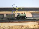
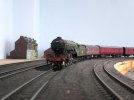
It's been quite some time since I did any work on the layout but with better weather I became motivated first to tidy and clean the garage (the layout's home) and then to connect up the lower loop on the light railway to the BR yard on the higher level. Here are a few images of my test train.

yk 252.jpg

yk 254.jpg

yk 259.jpg

.... and here the jury rigged wiring to allow testing/playing.

yk 258.jpg
 

Neil

Western Thunderer
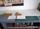
Yesterday I made a start on the much prevaricated over backscene. I stated with some rough sketches which I transferred to cut down rolls of lining paper and when happy with the basic size and shape squared everything off with a ruler.

yk 264.jpg

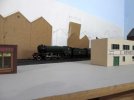
Here is the first section in place to see how it looks. I'm aiming for muted tones, simple shapes and little detail to get the effect of recession and distance. The track is so close here that all will have to be done in 2D apart from walls and fences alongside the tracks.

yk 261.jpg

yk 262.jpg

While I had some stock out to see how everything looked I couldn't resist a bit of a play too.

yk 263.jpg
 

Neil

Western Thunderer
A few days after my last post Mrs R and I took a trip back to York to catch up with family and on the way back stopped off for a couple of nights in Ironbridge, principally to revisit Blists Hill. We've been there before but were surprised when we worked out it must have been twenty five years or so ago.

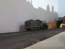
Once back in sunny Nanzarote on the Costa Cambria I knuckled down to the backscene. The drawing on the roll of lining paper was cut out along the skyline using a ruler and craft knife. The tracery was then stuck in place with strips of masking tape and I drew round it onto the sky coloured walls with a sharp pencil, the lining paper being thick enough to act as a template. I had originally intended to block in the buildings in slightly washed out tones and use some hand cut stamps to put in windows, doors and chimney pots. When I looked at the outline of the roof-scape pencilled onto the sky I began to wonder if I could get away with a monotone silhouette. After a bit of thought I decided to give it a go so mixed up a pale-ish smokey grey and got the brushes out. An hour and a half later and I had what you can see in the following photos.

yk 265.jpg

yk 266.jpg

yk 267.jpg

yk 268.jpg

yk 269.jpg

Now I'm not sure this would work for every layout or that it would be to everyone's taste but I'm pretty happy. Given that Northern Town is a bit of an experiment with a philosophy of doing only just enough to convince rather than pushing the envelope of detail possible I think it works. So far I've only done one wall of three that require a backscene, but it is the longest at about fourteen feet. The other two should hopefully come together fairly quickly and I may be able to recycle some of the templates I've made by cutting and reordering the pieces, possibly reversing some although I will need some bespoke stuff where the Bar Walls end and behind the chemical works.
 

Yorkshire Dave

Western Thunderer
I like the idea :thumbs:.

In my case I'd have painted the skyline to either 2 or 3mm scale to create the illusion of distance and faded the top third into the sky to create a haze leaving a hint of the skyline. This would push the backscene back as not to dominate and draw the eye from the layout.
 

simond

Western Thunderer
I like it lots, showed Ms & Mrs D, their view is that it is too pale.

I wonder if a sense of distance might be enhanced by “layers of grey”, though this might become complicated and detract from, rather than framing, the layout.
 

ColPeake

Member
Another "like" for the idea, I do wonder if in some places it dominates the trains in front (I have a thing about eye lines on backscenes). Another shade of grey in front may be an advantage.

Colin
 

Neil

Western Thunderer
Many thanks for the comments and ideas chaps. There's bravery in offering honest opinions and I do appreciate it. You'll have noticed that the colour shifts about a bit between the images, a combination of lighting and the camera but I'm pretty happy with the shade of grey. There will be stuff between the tracks and the backscene, mainly walls and fences which I hope will act as a sort of transition layer.

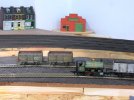
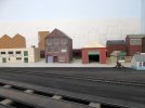
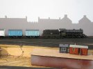
Colin, I suspect that the bit that dominates the trains is the area in the fourth photo and the saw toothed factory/warehouse in the first shot. On the layout the first runs into the second and the reason that they look to overpower a bit is that they are higher ground. Hopefully once I've put a retaining wall in front of this bit (bigger and longer than the card mock in image one) the dominance will be countered.
 

Jordan

Mid-Western Thunderer
I like the way the silhouette profiles cut out the perspective problems of many a backscene containing buildings when they're looked at from an angle; there's no awkward foreshortening of things to distract from the 3D scene in front.
 

ColPeake

Member
Colin, I suspect that the bit that dominates the trains is the area in the fourth photo and the saw toothed factory/warehouse in the first shot. On the layout the first runs into the second and the reason that they look to overpower a bit is that they are higher ground. Hopefully once I've put a retaining wall in front of this bit (bigger and longer than the card mock in image one) the dominance will be countered.
Yes, it was indeed that area, I would have said it a bit better but I was posting from my phone with a broken screen and stringing a reply together was getting tedious :) The retaining wall should make all the difference along there and nicely separate foreground and backscene. I appreciate that it is a fairly narrow strip to work on but would there be space at the top of the wall for a hint of vegetation to soften the join?

Colin
 

John Duffy

Western Thunderer
Many years ago there was a OO layout called something like Little Burton or the likes and they used a similar back scene with layers of different greys to simulate the distant view. It worked well to show distant rooftops. To my eye you need something in the foreground so that all that remains is the distant view, I suspect lowering the first layer would help.

John
 

Neil

Western Thunderer
.... would there be space at the top of the wall for a hint of vegetation to soften the join?

Colin

Yes there should be, at least I hope I can squeeze it in. It really is very tight for depth along most of the long wall.

Many years ago there was a OO layout called something like Little Burton or the likes and they used a similar back scene with layers of different greys to simulate the distant view. It worked well to show distant rooftops. To my eye you need something in the foreground so that all that remains is the distant view, I suspect lowering the first layer would help.

John

I think I might know the layout you mention, however the silhouette you see in the photos has to represent the first line of structures bordering the tracks. York being pretty flat doesn't have rows of housing stepping up a hillside so you would only see the front row of housing. If I have got this link right then my imagined stretch of railway is to the left of the road, Bishophill Senior, here on Google streetview. Also I feel I need to point out again that the layout isn't being built to be as perfect as possible, the philosophy being that I do just enough rather than all I might, less being more. The other thing to bear in mind is that the brain perceives stuff differently through the eyes than when filtered by camera.

Here's another couple of shots showing the full length of the 'backscene' so far.

yk 272.jpg

yk 273.jpg
 

Yorkshire Dave

Western Thunderer
Seeing the whole of the skyline in the whole thus far really looks the part rather than the individual photographs :thumbs:. Once the 'front' 3D detail is there the skyline will fade into the background.

As you rightly point out the eye sees things differently and we as, being part of the animal kingdom, benefit from a rapid autofocus when looking at detail. As such the periphery and background are not seen so to speak whereas cameras capture everything unless you play around with the depth of field.
 

Simon

Flying Squad
Seeing those full length pictures makes all the difference.

Whilst "in detail" all of the comments above make perfect sense, looking at these pictures I can see what you mean and think it works really well.

In fact it might even be a bit of pure egnius on your part...

Maybe it's that "bigger picture" thing people talk about...
 

Neil

Western Thunderer
.... In fact it might even be a bit of pure egnius on your part ....

Thank you Simon; isn't there supposed to be a fine line between genius and madness?

Anyway I've applied some more colour, this time to the end wall of the garage, just the short stretch to the side window remains but I need to get a firmer grip on how the 3D part of the layout will look there.

yk 274.jpg

yk 275.jpg

yk 276.jpg
 

Neil

Western Thunderer
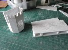
As well as bringing back happy memories from our recent holiday in Antwerp Mrs R and I also brought back Covid. As a result I've only pottered along at a slow pace putting together a short section of York's Bar Walls and the tower at Baille Hill. It took three card mock ups before I was happy with the sizing of the tower; here the cardboard castle stands in company with the basic tower structure formed from two layers of 80 thou plasticard.

yk 279.jpg

In an unorthodox sequence the basic shape was built before door and window openings were pierced and the crenelations cut away at the top.

yk 280.jpg
The short section of wall is from more 80 thou with scribed stonework in a larger and more random pattern than the tower which was built in the Victorian era, seen here in position on the layout.

yk 281.jpg
 
Top