GWR and BR(W) building colours...

LarryG

Western Thunderer
No doubt many modellers have noticed the variety of colours seen in GWR albums in BR days, as well seen on historical models and heritage lines depicting GWR days. I have tried to apply some logic to it all and failed! Even two model paint manufacturers cannot agree on light and dark stone.

Many buildings carry what appears in print to be cream or custard. It could of course be faded light stone, but in pictures that include blood & custard coaches, it is obvious that both 'creams' are similar. Then there is the variety of 'dark stone' shades. Considering the Big Four companies were able to buy ready-mixed colours from at least the 1920's, there is little scope for saying paints were mixed by hand in the 1930 onwards. Or did this continue for some reason?

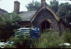
On Cambrian lines for instance, many buildings were a reddish mid brown and what looked like bleached cream. They were maybe faded GWR Light & Dark stone. True BR dark brown & cream colours are distinctive and could not be mistaken for other colours.
 
Last edited:

simond

Western Thunderer
I can't help on the original colours, on my models I have tended to Precision Paints' enamels in light and dark stone for my buildings (and those I purchased from Larry and backdated to GW days) but I would love to find a suitable source of acrylics - the likes of MIG and Vallejo seem to be happy to use military names and the Warhammer style of supplier uses fantastical (and potentially scary) names such as Hobbit-Gore for a decent signal red..., logical for each of course given their key markets.

Acrylics are so much easier to use indoors.

If anyone can offer an equivalence between the typical paints we might use, and some of these military and fantasy colours, that would be excellent - there is a table relating railway colours here, https://www.westernthunder.co.uk/re...t-colours-and-the-closest-modelling-paint.17/ and my post from '21 which links a range of sources


Perhaps it could be updated.

atb
Simon
 
Last edited:

J_F_S

Western Thunderer
there is little scope for saying paints were mixed by hand in the 1930 onwards. Or did this continue for some reason?

I could not offer firm proof, but I would be pretty certain that they were tinted by hand much later than this. The reason is to avoid the keeping of stock - just a few tins of white lead and three bags of pigment is enough to mix hundreds of different colours. This would be particularly true of site-work (unlike in a main works for example) My local B&Q mixes paint on site for exactly that reason. (5k+ colours in seven different finishes)

Colour is always a bit contentious, however, I do claim to have seen, in the flesh, a station painted in GWR colours. Caveat:- I saw it at least 40 years after it was previously painted!!!

I did take some colour photos and although colour imaging is another minefield, these are Kodachrome slides which have always been regarded as both true to life and stable over time. FWIW, I do seem to remember it "looking like this" ...

Here are few images and I look forward to hearing what people make of them. It is clear that there are at least three and possibly four different colours in use (notice the "maroon/brown" front door).

I took one or two of the signal box on my first visit but the images are taken into the sun and the colours show indistinctly. Unfortunately, by the time of my second visit, it had been burnt down. I do however seem to remember its colours looking a lot more like a very faded version of the brown and cream of the Western region so possibly the S&T had repainted it early in WR days.

In theory, this building still exists, but the last time I visited (about 10 years ago) virtually everything had turned to dust.

Watlington, 1973 / 74

31 Watlington.jpg32 Watlington.jpg33 Watlington.jpg

Those give the flavour, but I do have several others if they would be of interest.

Hope that is of helps!

Best Wishes,
Howard
 

Attachments

  • 29 Watlington small.jpg
    29 Watlington small.jpg
    958 KB · Views: 4

LarryG

Western Thunderer
Thank for posting these images Howard. Definitely could be taken for Dark and Light Stone similar to model paint by Phoenix Precision. Both are faded. The darker coloured door is familiar to me, as I have seen similar on other photos.
 

LarryG

Western Thunderer
Thanks Tim. The Coalport (SVR) bleached light stone showing under the dark stone could be replicated by using cream. Howes Railmatch 425 New Stone, or 426 Weathered Stone would fit the bill.
 
Last edited:

J_F_S

Western Thunderer
One thing which comes to me:- these buildings all look quite pleasing to my eye. This makes me think that "some" preserved lines have just got it completely wrong as the results look absolutely ghastly!

Just from a modelling point of view, I feel that those who model in traditional materials - such as card and paper - have an advantage in that they can use water colours which represent these such subtle shades very well: just look at Jon Ahern's Madder Valley at Pendon, or Pendon's own modelling. For plastics, "Enamel" paints can be mixed to represent a faded shade, but can give a poor finish unless sprayed and can be a tricky to 'weather'. Acrylics have the problem that when mixed, the shade when wet is unpredictably different from when they dry. But they are easy to apply, dry to a predictable degree of sheen, and weather easily with powders etc. For that reason, I have used acrylics for this task. I model the Southern which is less uncertain from a base colour viewpoint, but what those colours fade to is just as problematic!!! My personal take is that any "pre-mixed shade" - in whatever medium - can never be any more than a basis from which to work. To show what I mean, here is my affort to represent the Southern's green and stone after about 10 year's fading and deposited brake block dust. (it is supposed to represent an engine shed repurposed as a store. This is done using Valejo's acrylics on plasticard. Sorry it is off-topic for the GWR, but I hope it provokes a few thoughts.

Southern small.jpg

Best Wishes,
Howard
 

jonte

Western Thunderer
I don’t think there’s a definitive for this.

Here’s another that might prove of interest that I collected along the way, from I know not where, but appears to have been collected from Brill:

623757CF-F90E-49BF-99E5-BE1DE707EC08-182-000000211D9A5C3A.jpeg

Probably of no assistance, but rather proves my point.

jonte
 

Stephen Freeman

Western Thunderer
All done to death over the years, just be grateful for Precision Paints, I think there is something in Great Western Way on the subject but if you really have nothing better to do just follow the subject in Railway Modeller from the 1960s and others since then.
 

Tim V

Western Thunderer
It's interesting how the compression I had to use to post the Rowden Mill shot has changed the colour balance - it's got a red tinge. The original for both pictures were 6x6 Agfachrome Pro 50 negatives.
 

Bulldog3444

Active Member
For chapter and verse (literally) on the subject of Great Western Railway structure colours one can do no better than read the book "Great Western Railway Structure Colours 1912-1947" compiled by Richard North and published by the Great Western Study Group in 2013.

GWR structure colours 1912-1947.jpg

It runs to 88 pages, and includes a colour photos taken in the 1950s and 1960s of station buildings, goods shed and other structures.

It draws on official sources - the records of the GWR Paint Committee (now you always knew that the GWR had a Paint Committee!) from 1912 to 1947. One of the main reasons for establishment of the Paint Committee was concern about the health impact of lead in the paint used for painting structures.

It is apparent that the use of ready mixed paint was quite prominent by the end of the First World War, though in some divisions it was still considered preferable to mix paint from its constituents through the 1920s and into the 1930s.

In the 1920s and again in the 1930s detailed chemical analysis was carried out on paints from a number of commercial manufacturers.

From a modelling perspective I think it is fair that there is no right or wrong shade for any of the GWR 'standard' colours. I have much sympathy with Howard's views in post 7.

I would also suggest that the contrast between GWR light stone and dark stone as represented by the commercial model paints available (and also as seen on some heritage railways) is rather greater than the contrast observed from photographs of the prototypes.

Hope that helps,
Ian
 

jonte

Western Thunderer
Here’s an example of GWR colours mixed on site, that not only looks very different on camera to the naked eye, but has also faded at different rates to produce differing shades of the same colour:

IMG_2485.jpeg

Okay, tongue in cheek, but perhaps a 1:76 scale example of what occurred in real life?

jonte
 

Stephen Freeman

Western Thunderer
I seem to recall from the long ongoing discussion in Railway Modeller that because of the pigments used, the action of UV light meant that you could choose just about any colours and not necessarily be wrong! Not that I would agree with that. As mentioned there have been books written but if you use Precision Paints you can't really go wrong unless you are trying to reproduce a known station and its known painting scheme.
 

SimonT

Western Thunderer
Here's the human bit. To me eyes the Precision Paints are entirley wrong. They are too intense and rich. So I now muck about with acrylics and claim BR WR brown and white overpaint. I've yet to find a single colour in the Vallejo/Mig/Armour/Whatever ranges to do dark and light stone.
 

LarryG

Western Thunderer
I remember the introduction of Precision paints was quite a landmark in the railway modelling world at the time, despite my personal reservations on one colour in particular. When I was a teenager, the paint on many railway buildings was far from new and this was particularly true of structures on quieter routes. Precision Paints most probably represent new paint and so they need modifying by the individual to suit a particular location. This was the idea behind starting this thread.

In some photos taken in the 1950s and 60s, there was little contrast between the light and dark stone. Jonte touched on this, so maybe this was down to the original 'mix' or maybe it was due to exposure (sunlight, sea air etc).

One thing about railways colours is they were not as brilliant as seen on the likes of fairgrounds engines. It was almost as if they were distressed even before application by adding a small amount of black. Certainly, while mixing railway colours in cellulose, I have had to add black or some other colour to give it the right appearance.

I am grateful to Bulldog 3444 for the heads up on the publication he mentioned.
 

Tim V

Western Thunderer
Relying on colour photographs and memory may not be a good thing.

I was looking through a book on BR Mk1 coaches - academic purposes only, but the colour of the blue/grey 70s pictures in this book were not what I could remember - and I was there at the time!

If they can't get it right with something as recent as the 70s (memory or colour rendition) what hope for earlier times?
 

D1010

Member
Relying on colour photographs and memory may not be a good thing.

I was looking through a book on BR Mk1 coaches - academic purposes only, but the colour of the blue/grey 70s pictures in this book were not what I could remember - and I was there at the time!

If they can't get it right with something as recent as the 70s (memory or colour rendition) what hope for earlier times?
Very good point, all sorts of factors come into play when looking at colour photos. The type of film used, the exposure settings used, the processing (different dyes, processes, etc) and the weather. Colours will always look more vibrant in sunlight. Maroon coaches can look almost bright red in sun. The same goes for colours of rust and dust. As a photographer, I often over exposed shots by half a stop to bring out the detail, the result being the colours would appear a shade lighter. Film types played a major factor as well, Fujichrome was superb with greens, while Ektachome was renowned for its strong blues. I preferred the latter for the record. The age of the film is another factor, as this produces colour shifts and dye fading.

So where does that leave us? Between a rock and a hard place, I suppose. Personally, I go with "if it looks right to me, I'm happy with it." Modellers licence and Rule No:1, etc.
 

Pencarrow

Western Thunderer
And we're entering the very subjective area of the appearance of colour with scale, lighting and weather etc...

I know it's often argued that the the Precision paints are often quoted as the colours to use but I'm not a fan. If we could travel back in time, I'm sure that if the model tin was taken up to a full size panel of paint it would match perfectly. Bob on for painting the full size real object.

However, the same paint applied to a smaller model just looks too bold and bright in my eyes. That's because effectively were looking at the colour from some distance away. Over distance colour becomes more washed out and restrained.

Try my theory out. Paint two panels the same bold colour. Move one progressively further away, does the panel in your hand still look the same as the one in the distance? In my experience no.

Like some others above, I now paint my buildings colours that to me look right on a model. So, generally, a less intense and more washed out version of the official colours. I'll also include shading, wear and weathering. Done well your model looks more realistic and less like a model.

A question I get asked a lot on threads, and when demonstrating, is what (single) colour I use for a particular materials (brick, stone, concrete, tarmac and slates etc). My answer is not one single colour but a varying mix of the same limited palette of paint colours, and even then it's subtly varied across the item being painted. Strong, uniform, colours just shout "model" in my opinion.

I must stress this is all my personal view and I'm not saying other approaches are wrong, just what ticks the realism boxes for me - the appearance/ feel of a colour is more important to me than absolute fidelity with the full size world. Others will have thier own preferences, and that's fine.
 

Yorkshire Dave

Western Thunderer
Following on from @76043 , @D1010 ,and as @Pencarrow alludes to, is the question of scaling colour - which has often been discussed.

Although a model is painted in the 'exact' colour as used by [insert preferred railway company here] it doesn't always look right as it is has been applied to a smaller surface area.

In most cases it appears darker which is why I always, like @Pencarrow, go for the closest and slightly lighter mix 'n' match colour(s) using colour photographs as a guide rather than gospel for the reasons stated in posts #17, #18 and #19.
 

Yorkshire Dave

Western Thunderer
Then there's colour perception after eating certain foods. And article by Dr Janet Voke in AHFAP Journal #9 lists all the common drugs that affect produce significant changes in colour vision. Just look at what caffeine does, reduces sensitivity to red, enhances blue.

So when your reading that book with a nice strong coffee, BR maroon will fade faster than your memory.

I really wish modellers would stop fussing about colour. You've no hope!

Interesting article. Would be interesting to know the effects of food dyes, additives, etc on colour vision.
 
Top